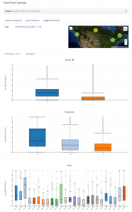
Figure 4: AppEEARS exploratory data visualization – Box and whisker plots showing statistics for each quality classification aggregated through time (top), each climate classification (i.e., Dfc, Cfb, and Dfb) aggregated through time (middle), and individual sites aggregated through time (bottom).


No Comments
Be the first to start a conversation