
Last year, the AmeriFlux database hit a big milestone: 3000 years of site data in our half-hourly Flux/Met data (BASE) product! This achievement is a great testament to the collaboration across the Americas, of the many site teams that make their data available to the AmeriFlux Network! THANK YOU to all those data providers!
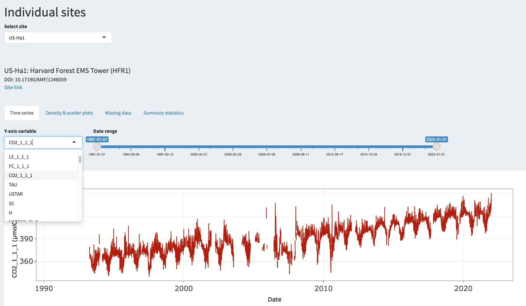
AmeriFlux now has 100+ sites with a 10 year or longer data record!!! The time series feature of the AmeriFlux Data Visualizer can help you see seasonal cycles, existing data gaps, and long term trend of atmospheric CO2.
In order to make this treasure trove of data more accessible, UC Berkeley PhD candidate Sophie Ruehr has built a data visualization tool that makes browsing the 3000 years of site data fast and easy. Here are three reasons why you should check out this tool, which was recently updated with new features:
Improving Accessibility
Especially for beginners in the field, getting a look at the data and how variables relate to each other is an important part of learning. Starting to work with Flux data can be overwhelming, and it’s useful to visualize data quickly while you are still learning to code. This tool is a way of accessing the rich datasets that will benefit newcomers and help orient them more quickly.
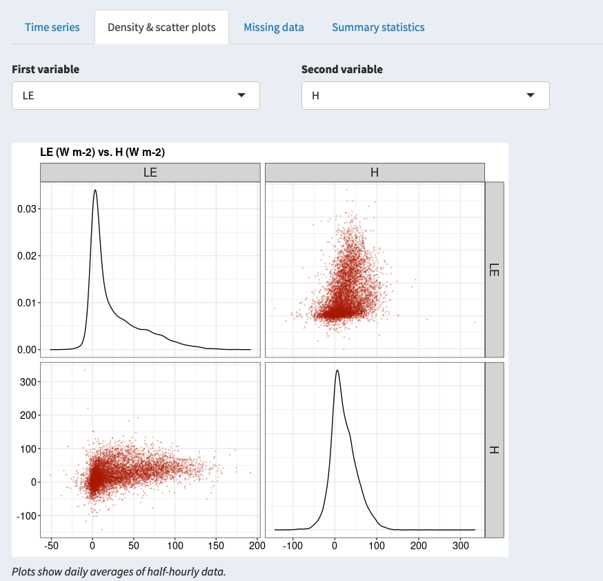
Using the Density and scatter plots tool, you can see the distribution of individual variables and how they relate to each other. In this example, selecting Sensible Heat Turbulent Flux and Latent Heat Turbulent Flux for US-Pfa gives us the Bowen ratio for a highly heterogeneous landscape of upland forests and wetlands.
Take a deep dive into the data
Sophie Ruehr, who developed the AmeriFlux Data Visualizer, says that she finds this tool useful when doing multi-site data synthesis or starting to work with a new site. It’s a quick way to get an overview of datasets and figure out whether they have what she’s looking for.
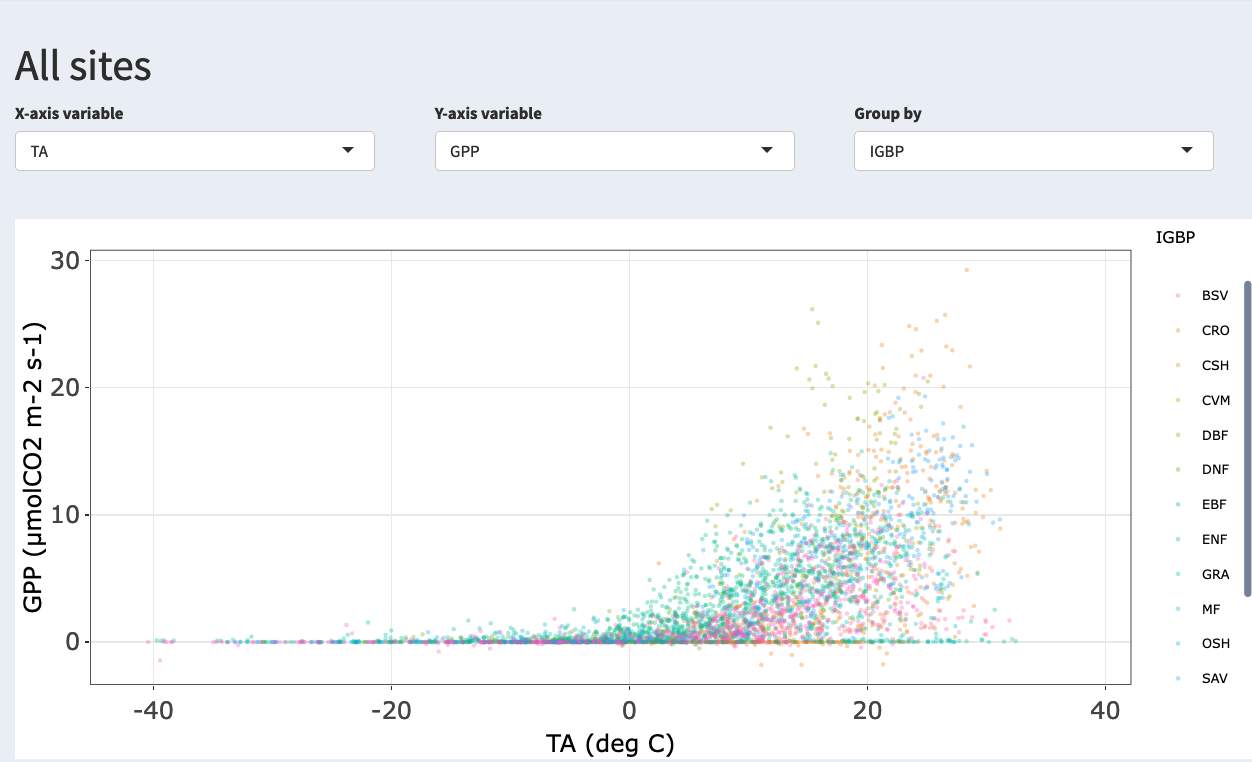
Using the All sites tab, you can visualize general trends across many sites, e.g. GPP increases with increasing Temp, but the details differ with IGBP!
Efficiency!
Have you ever downloaded a dataset and then discovered it was missing a key variable or it had large gaps? The Missing data panel can help with that. You see at a glance which variables are present and where there are gaps, helping you identify suitable data sets in no time!
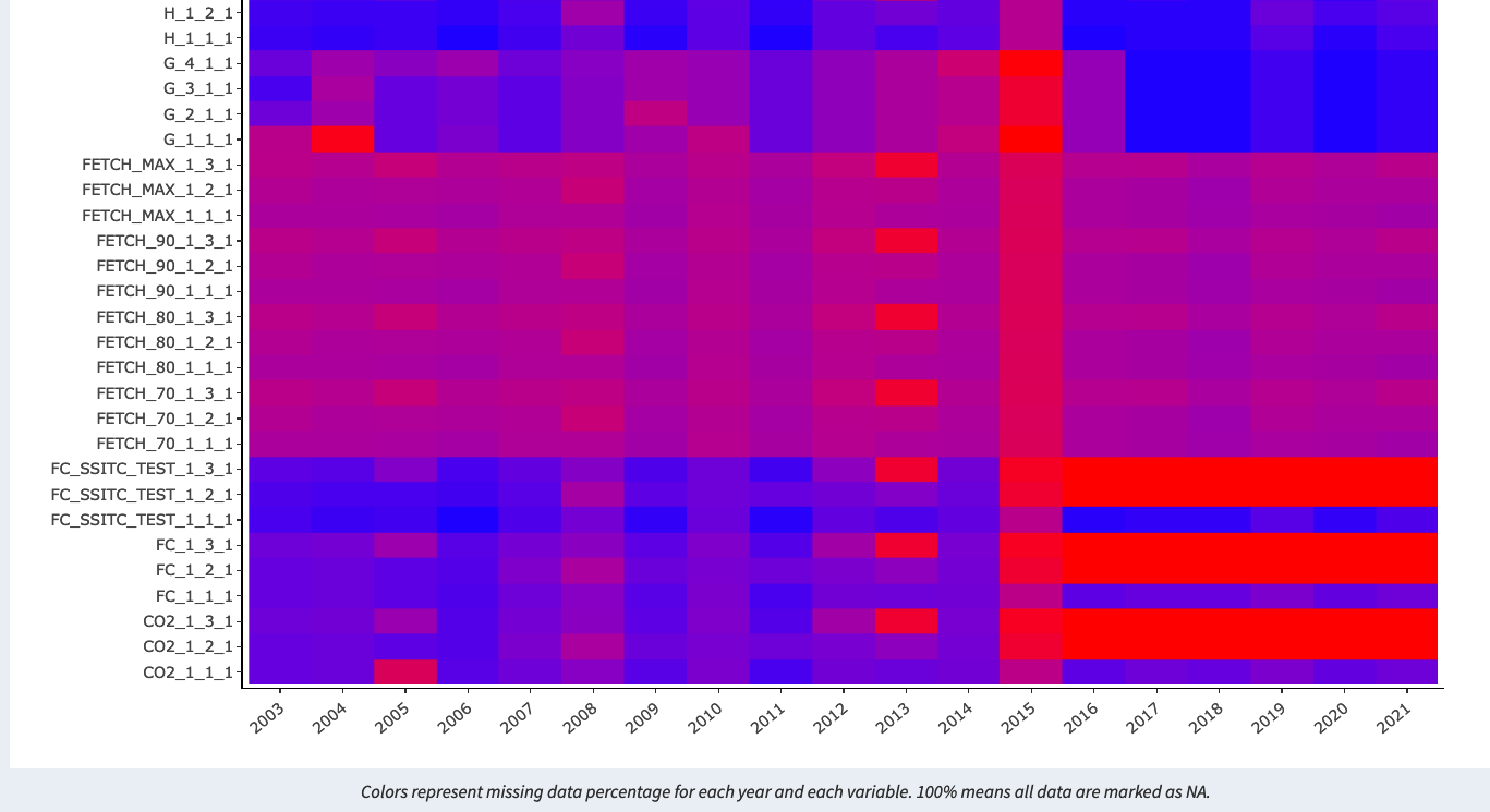
Data gaps are a part of life, but knowledge is half the battle… Use the missing data view of the AmeriFlux Data Visualizer to find out whether the variable you care about is complete in any given year.
Next Steps
Since launching this tool, the feedback from data users has been quite positive and enthusiastic. Obviously, from that enthusiasm spring dozens of ideas for improvements and more features, more than one busy PhD student can implement next to her thesis work. Recent updates now allow you to choose two variables to plot in the time series, plus a new diurnal cycle tab that shows mean and standard deviation for each variable at a site over the course of the day, separated by month! Go check it out now and spread the word!
In case you have ideas for improvements and new features, pull requests on the github are encouraged!
No Comments
Be the first to start a conversation